
Olei Clinic Design System: 50+ Components, Built Solo, Adopted by Engineering in One Quarter
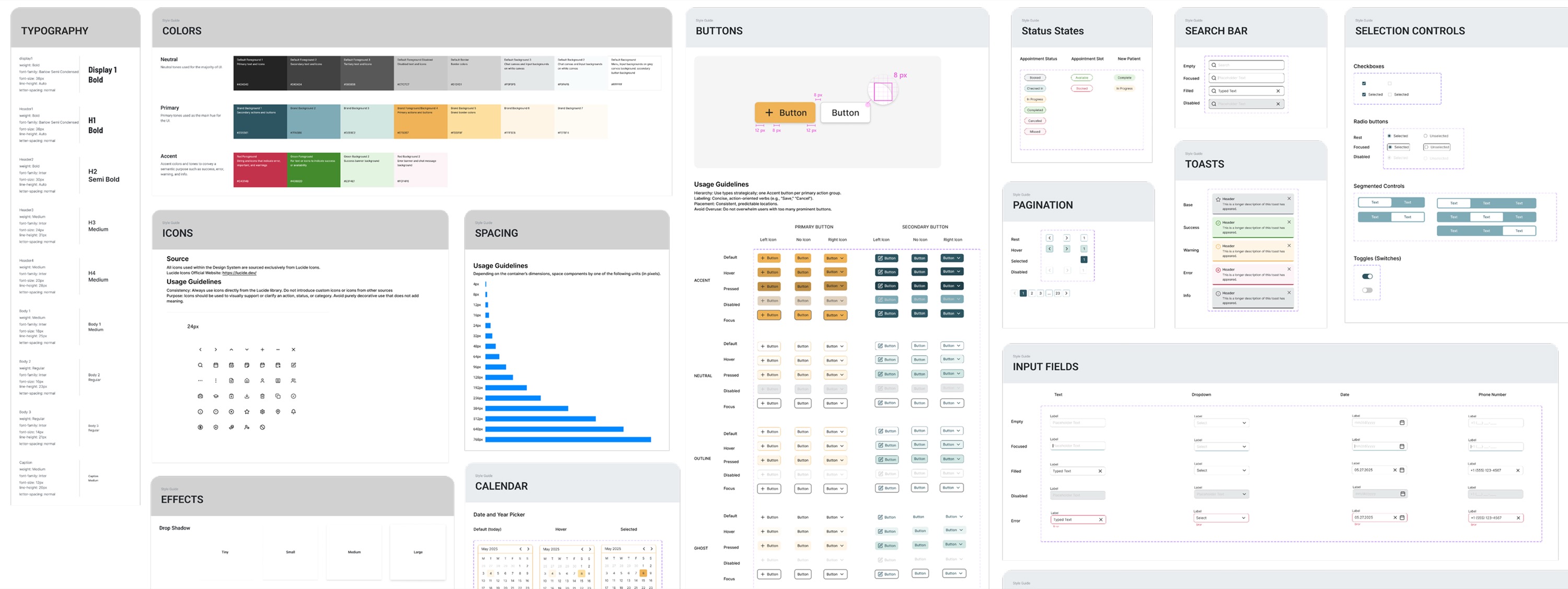
Engineers at Olei Clinic were rebuilding the same UI patterns from scratch every time a new feature shipped, with no shared components, no consistent tokens, no single source of truth. In a healthcare product, that inconsistency directly eroded user trust. As the sole designer, I built the design system from scratch and shipped it to active engineering use in three months.
- 0% Reduction in developer time to build common UI components
- 0+ Reusable components, developer-documented, WCAG AA compliant
- 1 quarter From zero to adopted by engineering
The Product Was Scaling Faster Than the Design Foundation Could Support
Olei Clinic is a scheduling and operations SaaS platform serving professional and teaching clinics.
The Problem
Engineers were rebuilding the same UI patterns from scratch every time a new feature shipped.
The Goal
Create a single shared component library that design and engineering could both build from.
Why It Mattered
Without it, every new clinic and feature added more inconsistency to a product that needed to feel trustworthy.
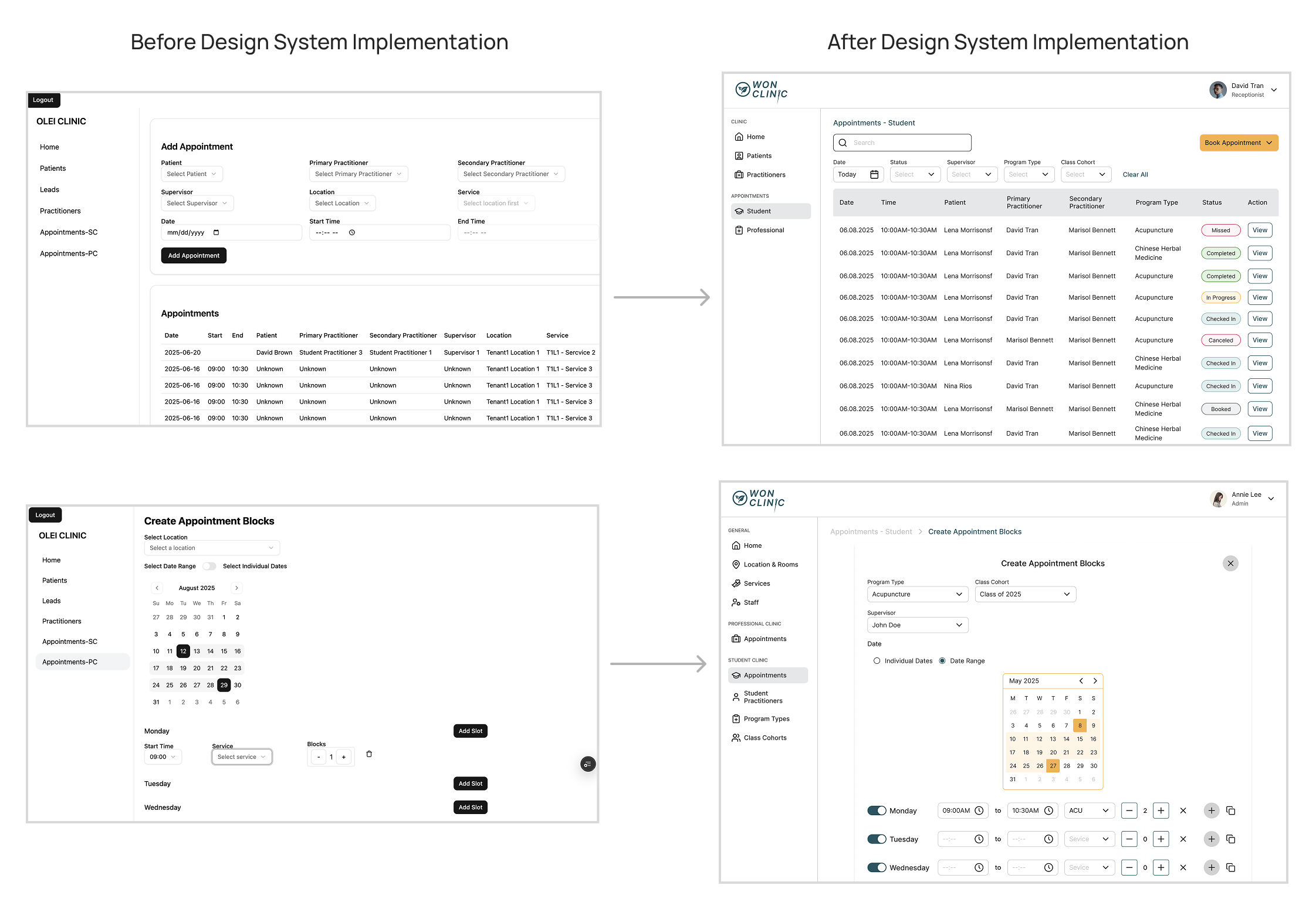
The UI Audit Revealed No Shared Rules. Every Screen Had Been Built in Isolation
Buttons had three different visual treatments with no rule for when to use each one. Navigation feedback was inconsistent. There was no shared spacing logic. Every screen had been built in isolation.
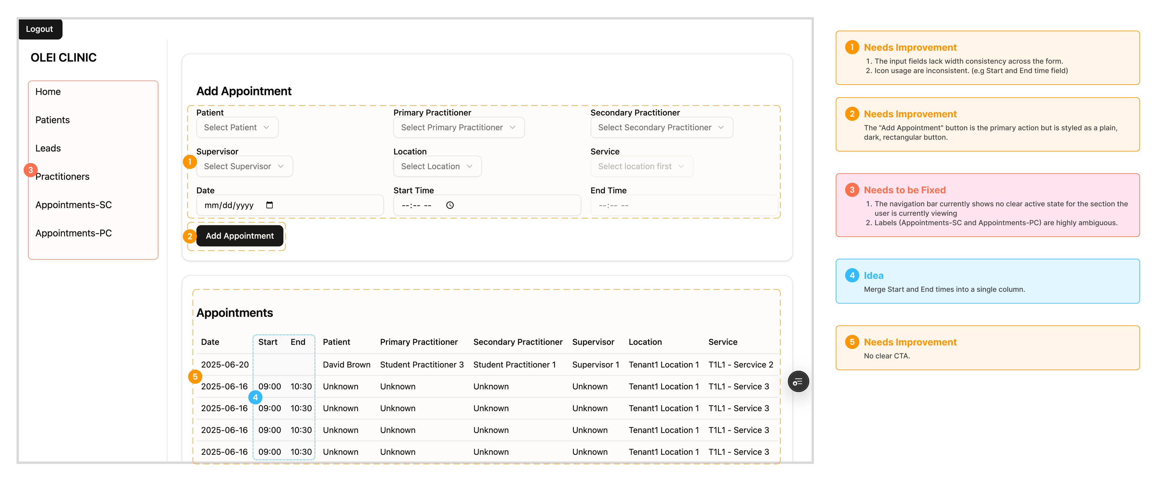
The Rule I Used to Keep the Library Lean Enough for One Designer to Build and Maintain
Before I built anything, I established a three-criteria rule for component inclusion. Every potential component had to clear all three:
- Was it used across three or more screens?
- Did it need multiple interaction states (default, hover, pressed, disabled, error)?
- Had a developer rebuilt it from scratch more than once?
If a pattern cleared all three, it became a component. If it did not, it stayed as a one-off. This kept the library lean enough to maintain as a solo designer.
System Design
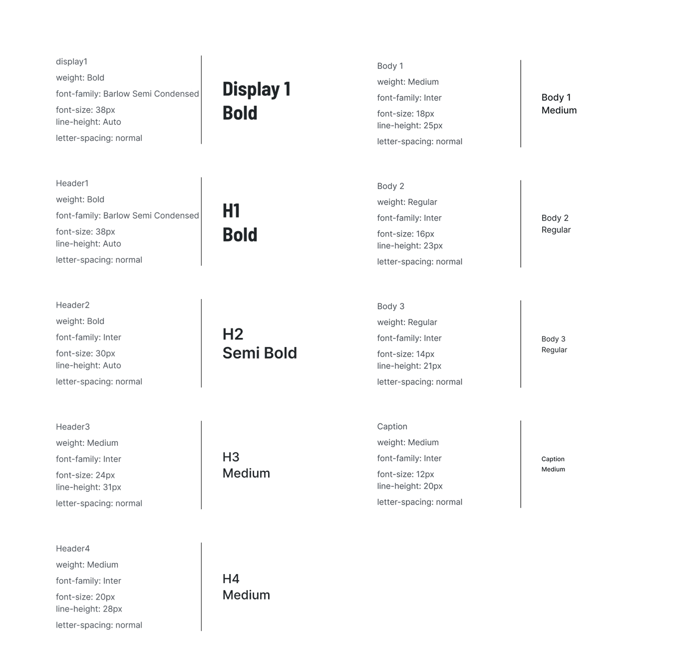
A 4-Level Type Hierarchy Built for Clinical Readability
Clear hierarchy across headings, labels, helper text, and system messages — designed so clinical staff could scan and act without having to parse the interface.
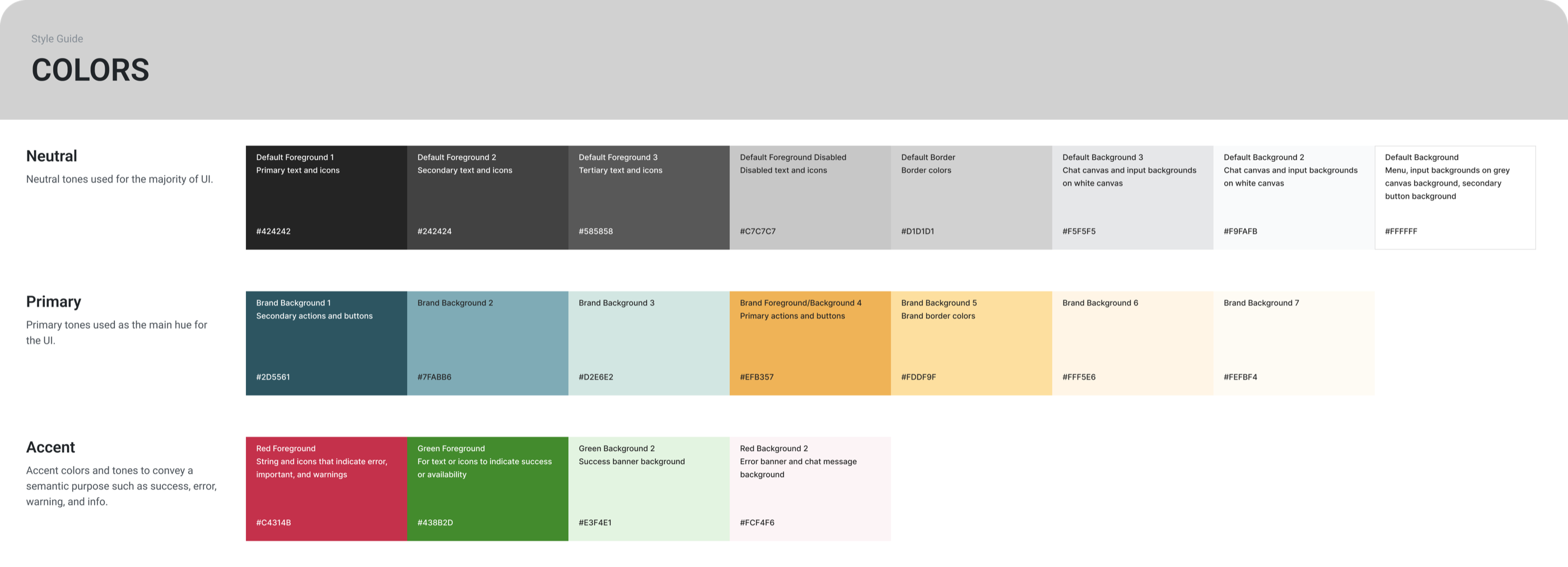
A Purposeful Palette Built Around Calm and Trust
- Neutral base — calm surfaces that don't compete with content
- Brand accents — calm blue and warm yellow, grounded in the product's emotional direction
- Functional colors — success and error states with WCAG-compliant contrast throughout
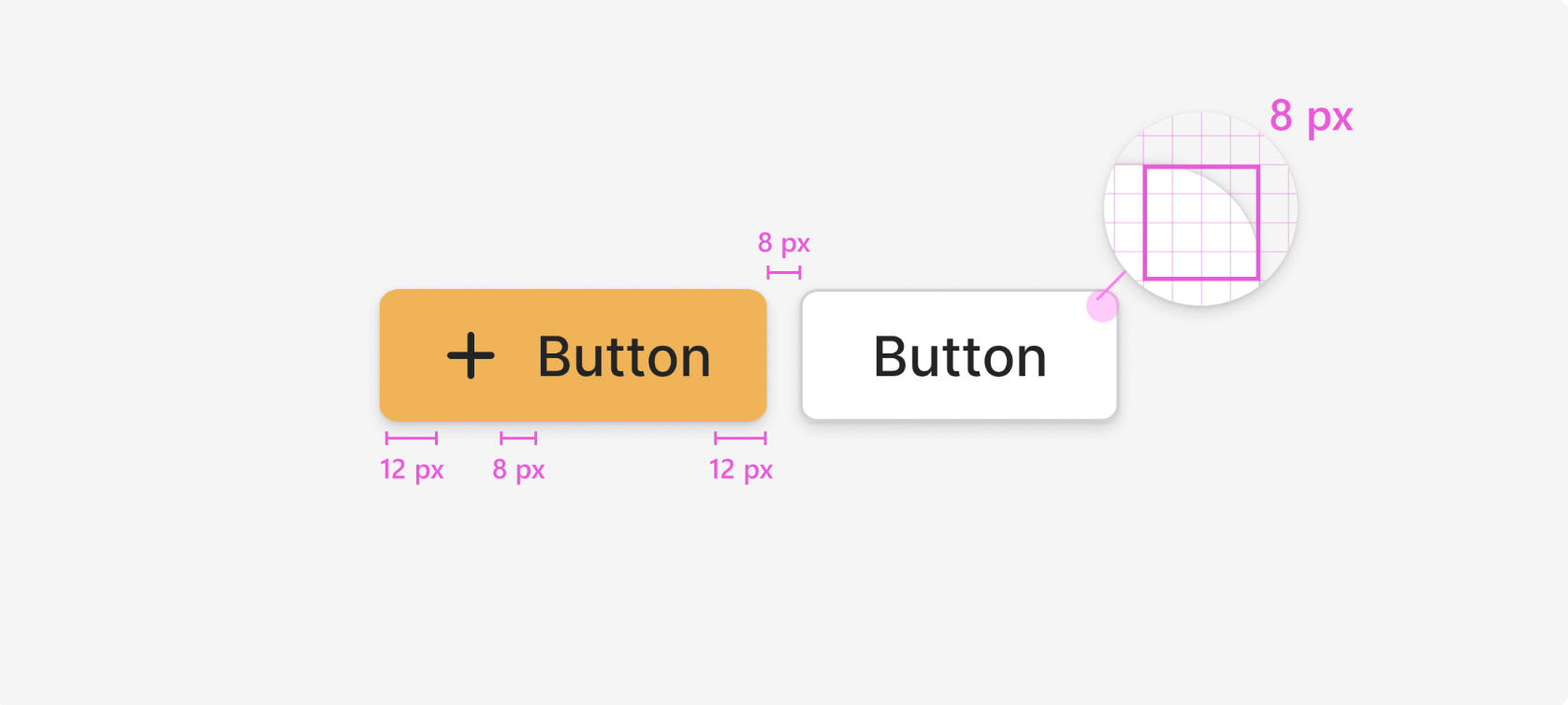
An 8px Grid System With Explicit Rules for Density, Padding, and Layout
Built with explicit rules for component padding, section spacing, and card and table density patterns so every new screen started from the same structural foundation.
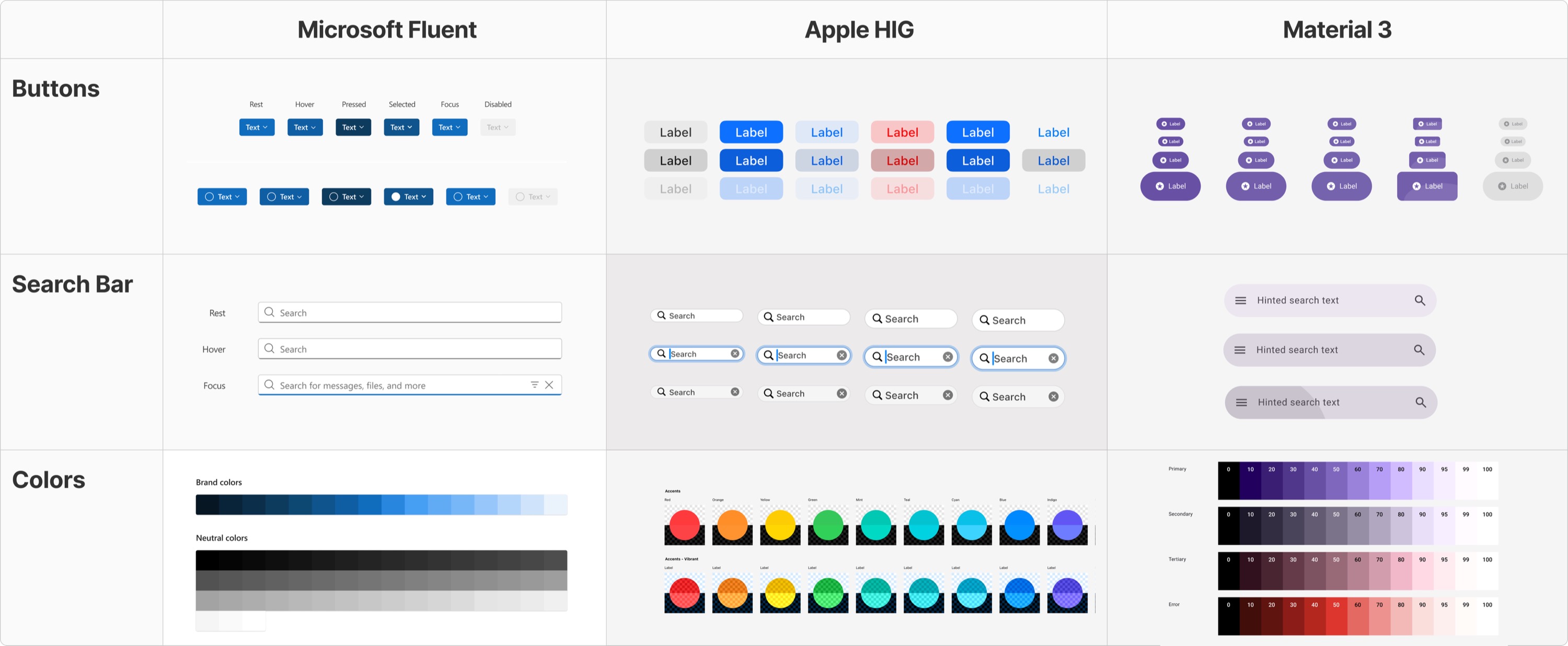
What I Took From Established Design Systems
I studied Apple HIG, Microsoft Fluent, and Material 3 — not to copy them, but to pressure-test my naming conventions and component scoping decisions against systems that had already survived production at scale. The biggest takeaway: semantic token names (surface-primary, not gray-100) would make the system legible to engineers regardless of how the visual layer changed.
Every Component Shipped With Embedded Documentation So Engineers Never Had to Ask Me a Question
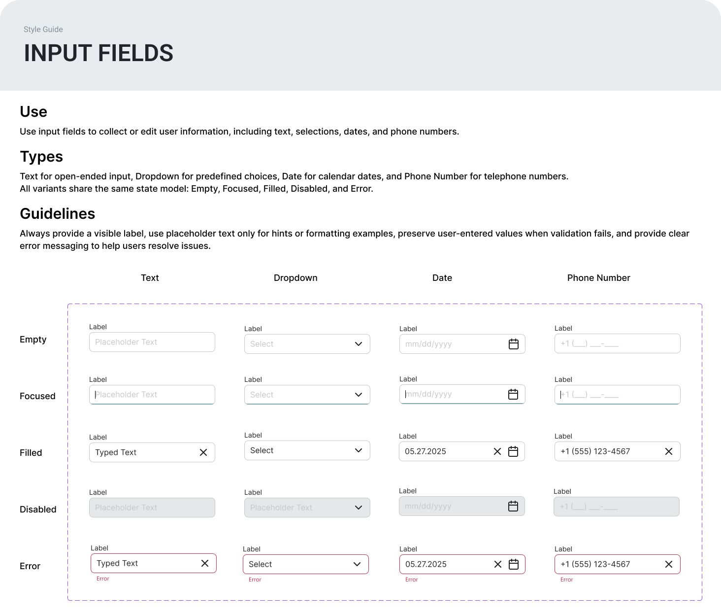
Every component in the library shipped with documentation embedded directly in Figma: what it is, when to use it, and Do/Don't usage rules with annotated examples. The goal was that an engineer could open any component, understand exactly how to implement it, and never need to ask me a clarifying question.
Weekly Engineering Check-ins That Kept Naming Aligned Before It Became a Problem
The agenda was the same every week: show what I was building, validate feasibility, confirm my naming matched their front-end structure, and cut anything that would never get used before I documented it.
Results
- 50% Reduction in developer time for common UI components
- Adopted in the same quarter it shipped. Engineering moved from rebuilding patterns from scratch to pulling directly from the shared Figma library with token and component names that matched the front-end structure.
As the sole designer, I built the system to outlive the project. Atomic structure meant any engineer could add a new component variant by following the existing patterns rather than inventing new ones. Before the system existed, design and engineering were working in different languages. After it, they were working from the same reference.
Reflection
- 1
Scope is how a solo designer survives a systems project
I had three months and no other designer. The temptation is to build everything at once. Instead, I used the three-criteria rule ruthlessly: if a pattern was not used in three or more screens, did not need interaction states, and had not been rebuilt by a developer more than once, it did not become a component. That constraint is what made the system finishable and maintainable.
- 2
Naming is the actual hard problem.
Every visual decision was straightforward compared to naming. Token names, component names, variant names — every name had to work in Figma and in code at the same time. The weekly engineering sessions were not optional. They were how I found out which of my names would cause confusion and which ones engineers would actually use.
- 3
A design system only works if engineers trust it enough to stop building around it.
The documentation was not a nice-to-have. It was what stood between a Figma file sitting unused and a system that actually changed how the team worked. The measure of success was not how many components I shipped. It was how rarely an engineer needed to ask me a question after launch.