
Closing the Loop on Packing Anxiety
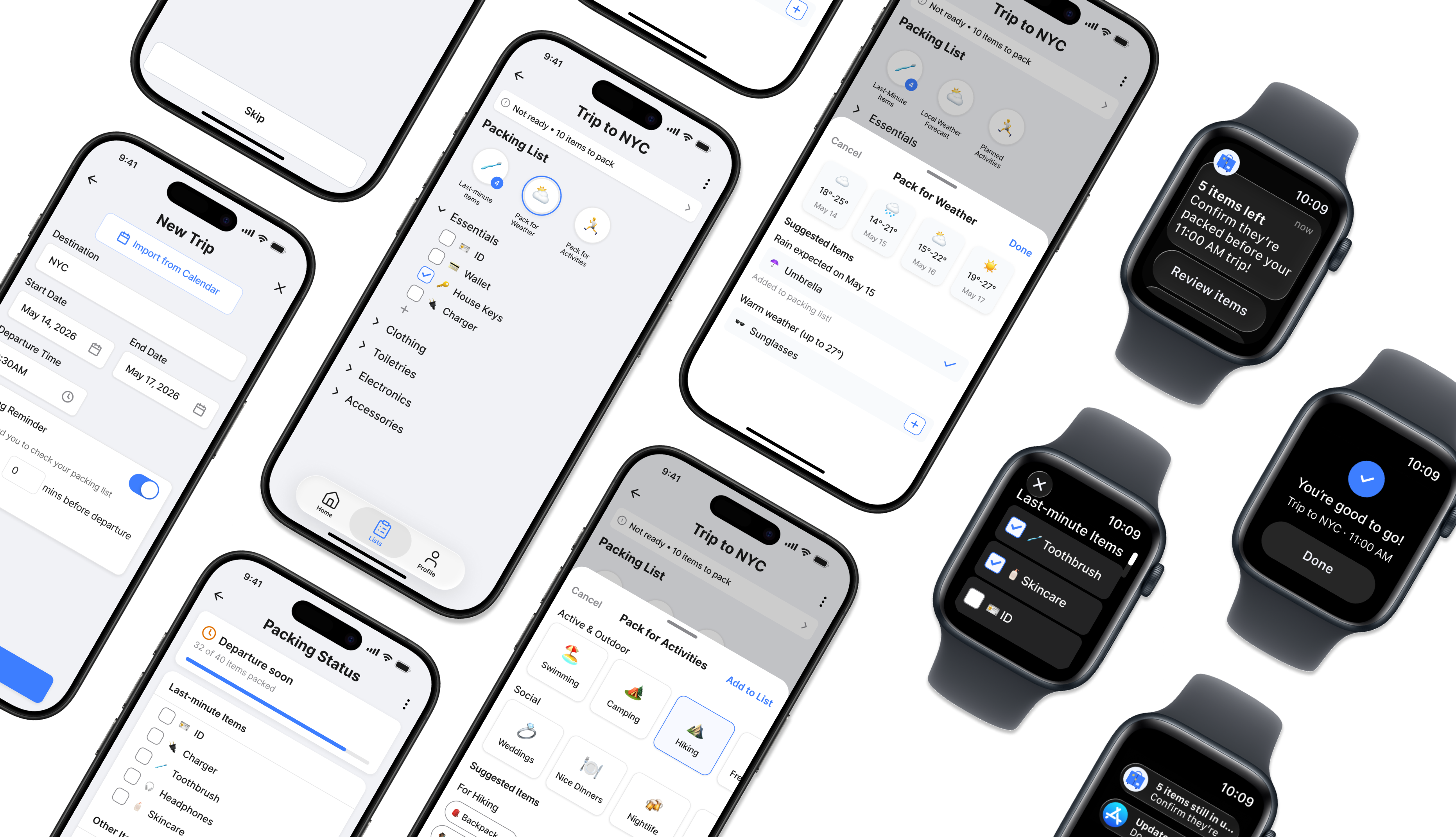
Most packing tools solve the wrong problem. They help people make lists. CarryOn was built to solve what lists can not: the feeling of not knowing if you are actually done. This capstone project explored why packing anxiety persists even among organized travelers, leading to an app centered around the moment that matters most — departure.
- 0% Task success across all core flows in moderated usability testing
- 6.4 Ease of use rating from test participants
- 0 Moderated usability sessions with occasional leisure travelers
The Problem
Packing Anxiety Is a Closure Problem
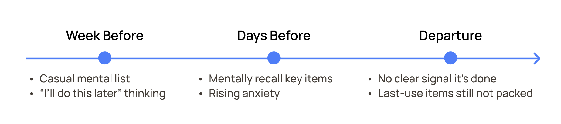
For occasional leisure travelers, packing is a closure problem. People do not forget to make a list. They lose track of what is still in use, wonder whether the list they made three days ago is still accurate, and never reach a moment that clearly signals: done.
The Solution
Designing for the Moment of "Done"
Rather than optimizing checklist creation, CarryOn helps travelers reach a sense of closure before departure.
- Context-aware packing suggestions
- Dedicated management of last-minute items
- A packing experience designed to reduce uncertainty and increase confidence
The Process
Understanding Why Travelers Never Feel Ready
Who I Studied
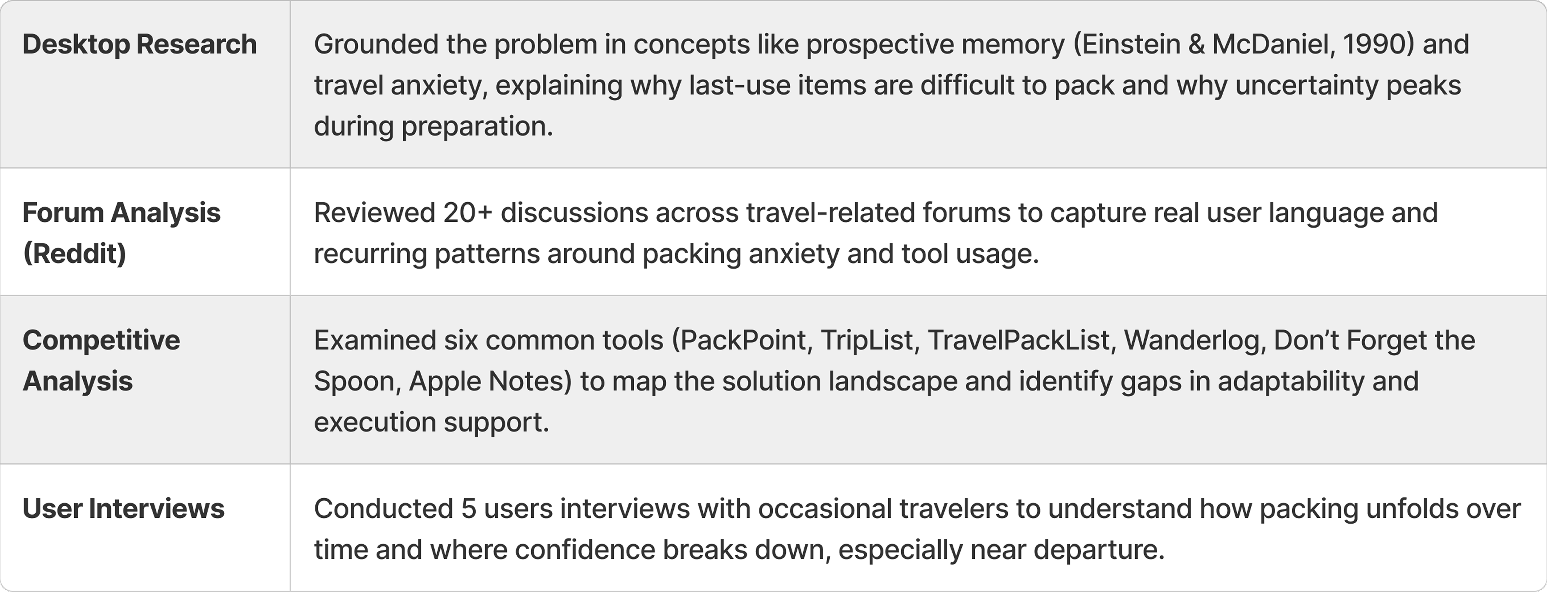
Occasional adult leisure travelers: people who travel infrequently, rely on informal mental strategies rather than tools, and consistently overpack or double-check as a response to uncertainty. Secondary research confirmed this is not just a behavior pattern — Fuchs and Reichel (2011) found that infrequent travelers experience measurably higher perceived logistical and psychological risk during trip preparation. That finding shaped every design decision.
Methods
To understand both behavior and underlying causes, I used a combination of qualitative research and secondary analysis. Interviews revealed how people actually behave, while secondary sources helped explain why those behaviors persist.
Three Reasons Packing Still Feels Incomplete
Three patterns emerged consistently across all methods. Together they pointed to the same gap: current tools help people plan, but do not help people close.
Last-use items are the hardest to pack
Still part of your routine right before departure, with no clear cue to pack them on time.
I can't pack my toothbrush because I need to use it, and then I forget to grab it.
Anxiety peaks without a 'done' signal
Finishing a checklist doesn't create a sense of completion. Without closure, the task stays mentally open.
It never really feels like it's done.
Lists don't adapt to the trip
Weather changes. Plans shift. A finished list can still be an incomplete picture.
Traditional packing lists make you forget things that are more outside the box.
From Better Lists to Better Closure
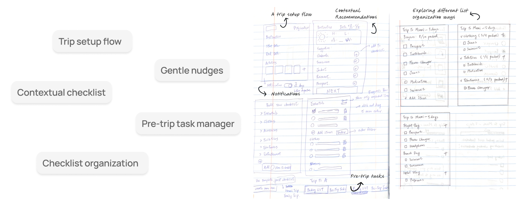
Early Exploration. Initial concepts focused on checklist organization, reminders, and pre-trip task management. These directions improved structure but missed the core issue: they helped people manage tasks, not resolve them.
Address Scope Uncertainty Before It Starts
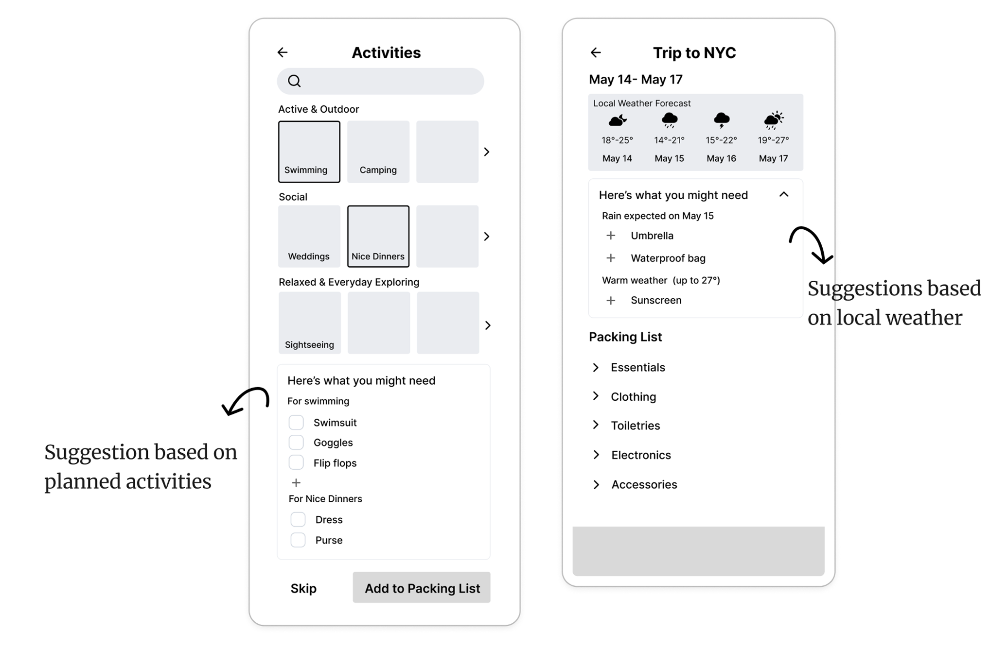
Travelers do not always know what they need until it is too late to pack it. Contextual recommendations surface items based on destination, weather, and planned activities. The goal was to make sure the list itself was complete before packing began.
Account for the Things You Cannot Pack Yet
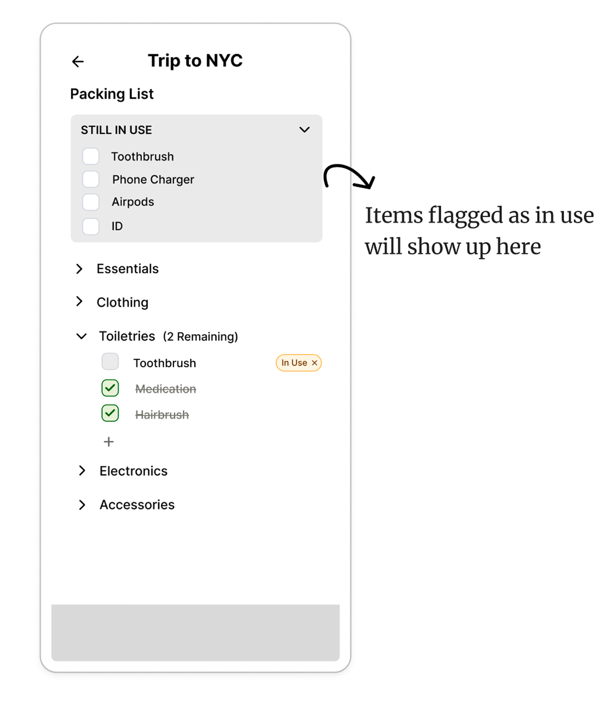
The hardest items to pack are the ones still in use the night before departure. Instead of asking users to remember them, the system flags last-minute items and holds them separately until the right moment.
Create a Moment that Actually Means Done
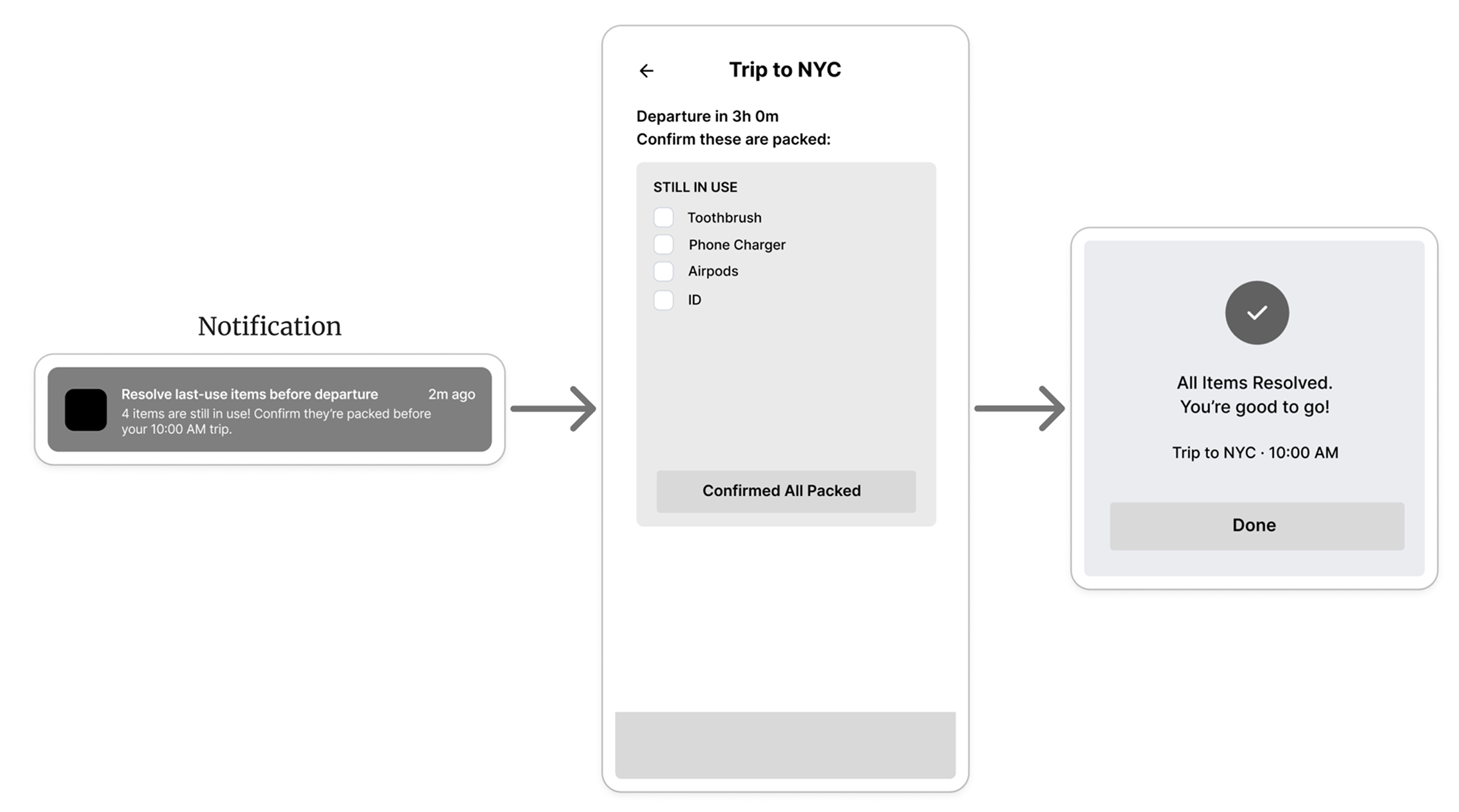
Without a clear signal, the packing task stays mentally open even after the bag is zipped. The departure confirmation gives users a defined endpoint.
Testing Whether Closure Increased Confidence
I tested a high-fidelity prototype with 4 moderated usability sessions and evaluated outcomes using a focused HEART framework: task success (could users complete the core flow without errors), confidence (did users feel ready to leave after using the app), and adoption intent (would users use this before a real trip). Testing surfaced three findings that changed the design.
Finding 1: Misinterpreted interaction model
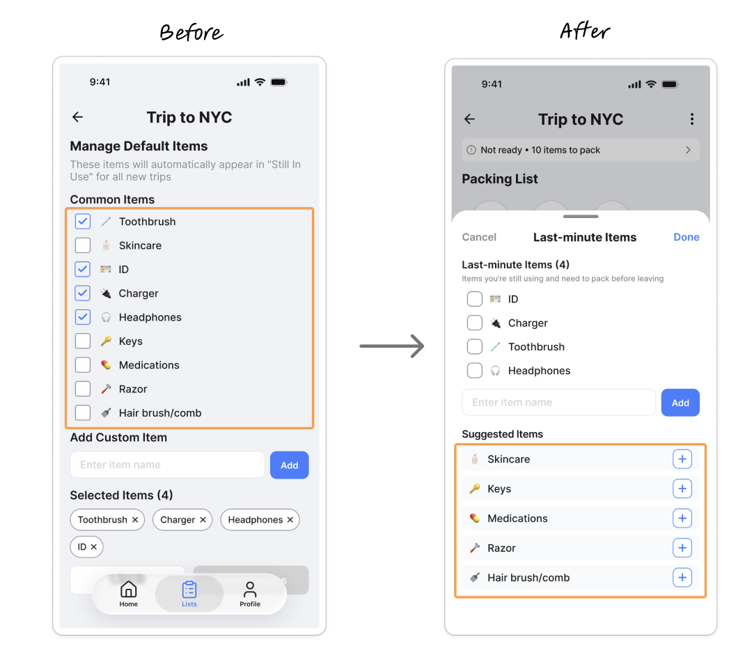
Users interpreted the checkboxes as a checklist to complete, rather than a way to select items. This created confusion and unnecessary pressure to "finish" the list. I redesigned the interaction to emphasize item selection instead of task completion, aligning it with user intent and reducing cognitive friction.
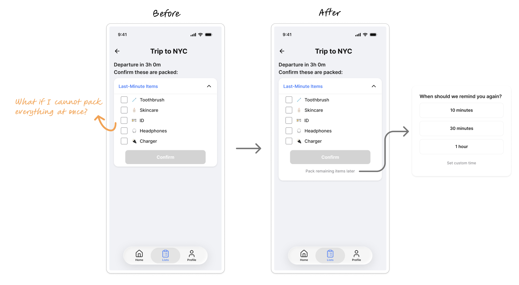
Finding 2: Real-world scenarios require flexibility
Users questioned how the system supports real scenarios, such as packing across multiple sessions and not completing everything at once. I introduced more flexible reminders to better support non-linear packing behavior.
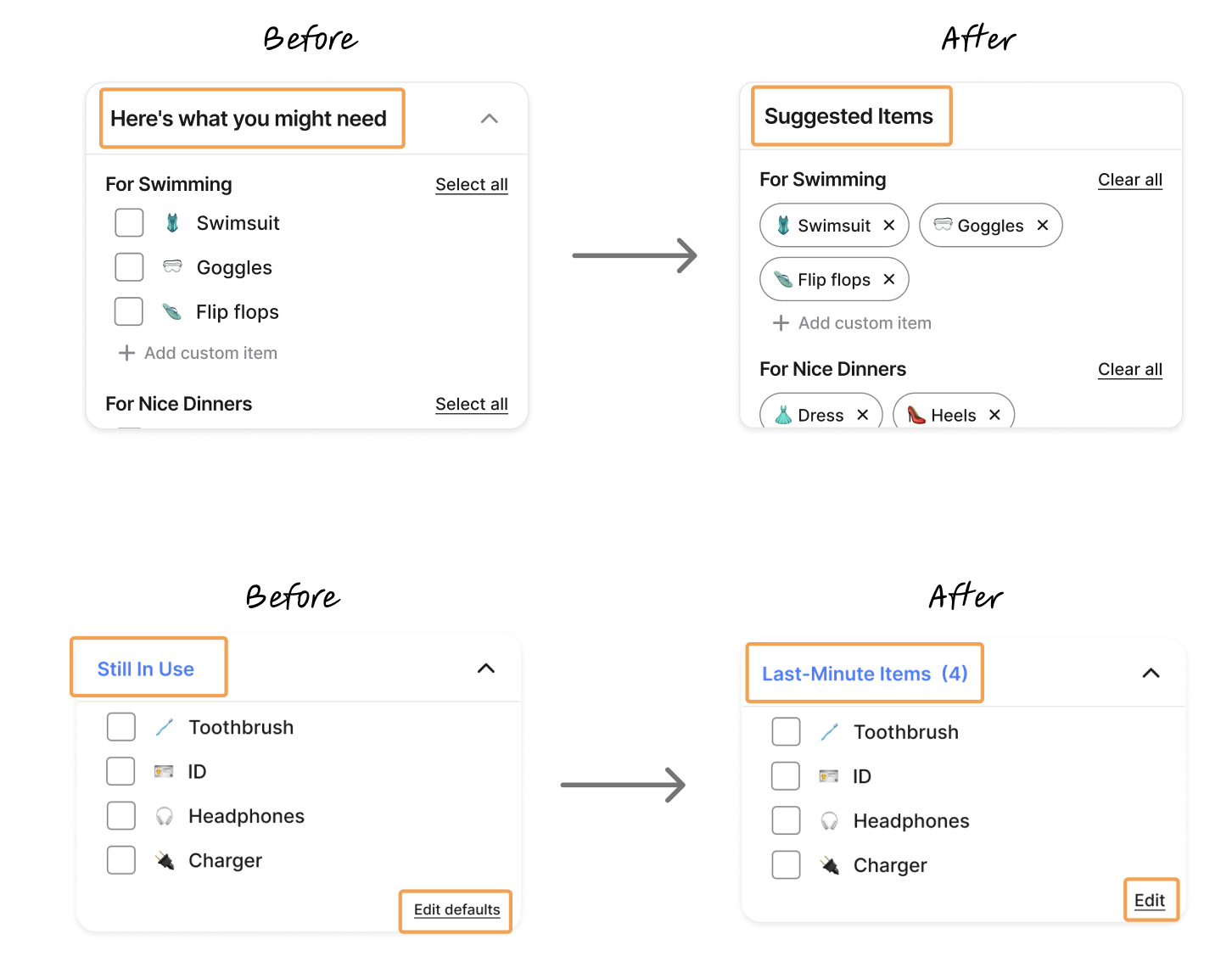
Finding 3: Labels were causing the wrong mental model
Certain labels caused confusion (e.g., "Still in Use," "Edit Default"). I refined labels and wording to be more direct. For example, 'Still in Use' implied the item was unavailable, when the intent was simply to defer it. Renaming it to 'Last-Minute Items' aligned the language with how users already thought about the category.
The Final Experience: Helping Travelers Leave With Confidence
CarryOn is a packing assistant designed to resolve one core question: "Am I actually done?" Instead of optimizing lists, the app structures the entire packing experience around three moments: deciding what to bring, managing what is still in use, and confirming readiness at departure.
Define the Trip Context
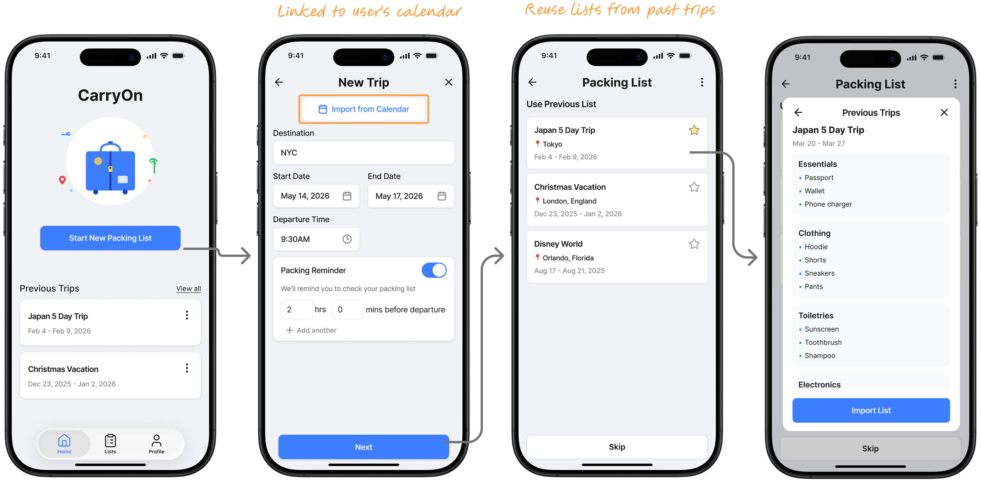
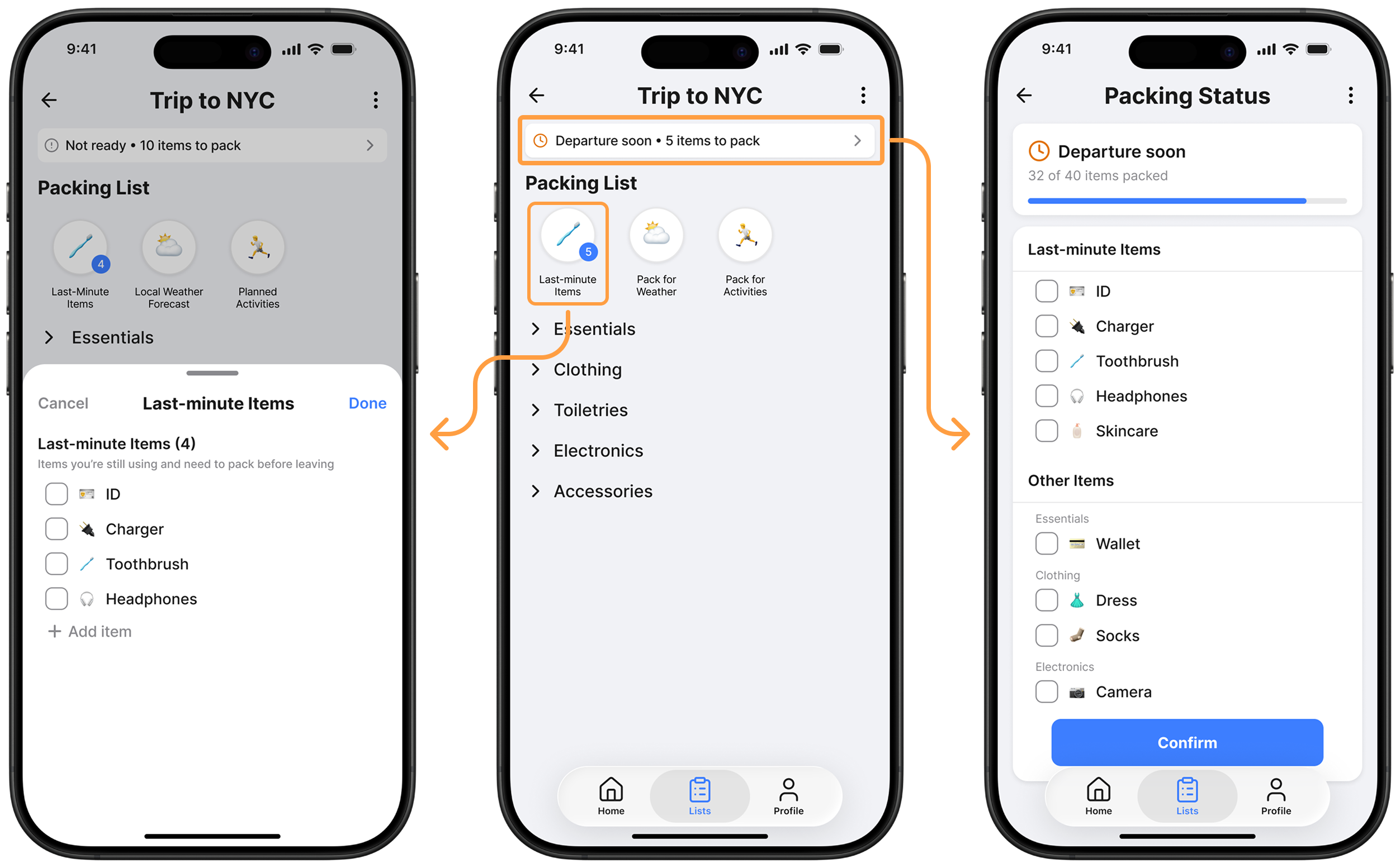
Packing doesn't start from scratch. Users begin by creating a trip with basic details like destination and dates, or importing from calendar. Instead of building a list manually, they can reuse a previous trip.
2.Surface What Might Be Missing
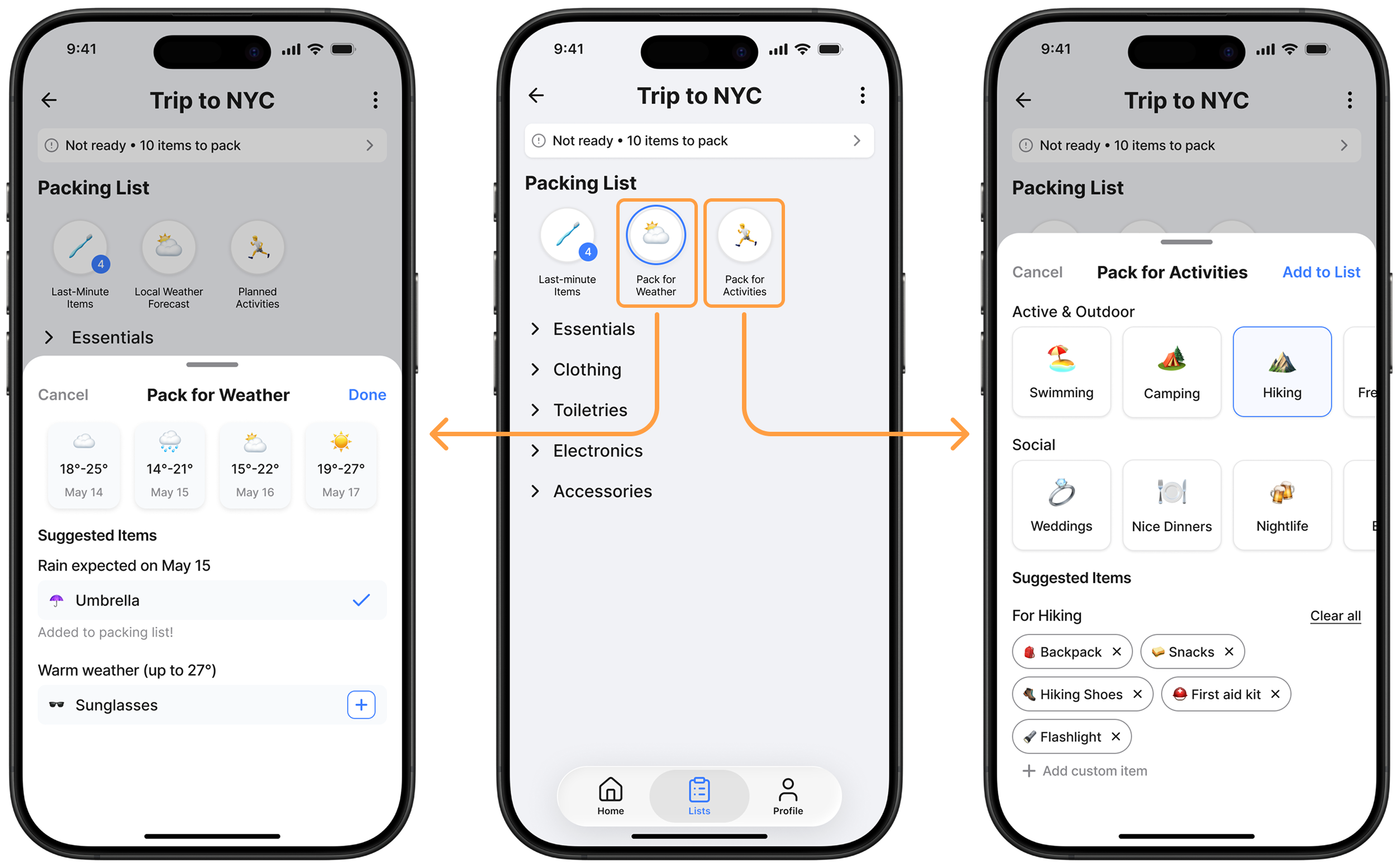
As the trip takes shape, the system fills in the gaps. CarryOn suggests items based on conditions like weather and planned activities. These suggestions are dynamic and update as the context changes.
3.Separate What Cannot Be Packed Yet
Packing happens in stages, not all at once. CarryOn separates items into what can be packed now and what needs to be packed "last minute." Everyday essentials remain visible but deferred until the right moment.
4.Confirm Readiness Before Departure
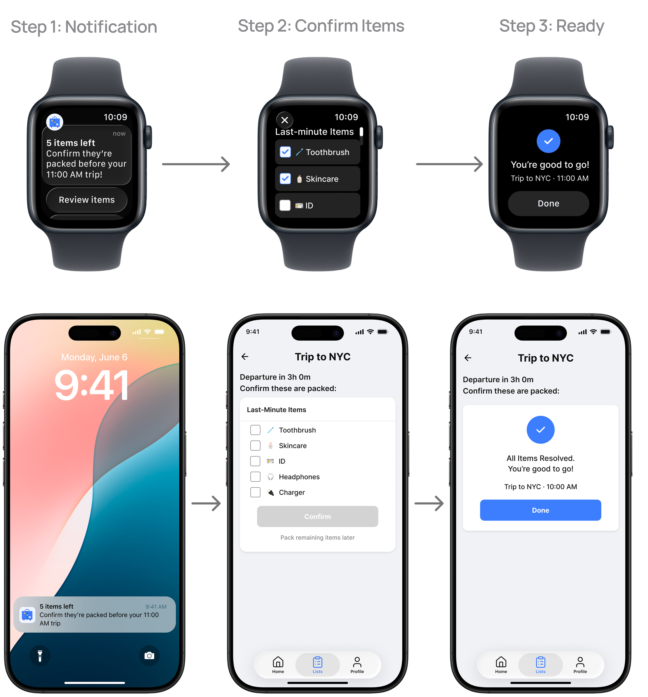
Right before leaving, CarryOn surfaces any remaining "last-minute" items through a quick interaction on the user's smartwatch or phone. Instead of reopening the full list, users confirm what's left in seconds. Once completed, the system provides a clear signal: you are ready to go.
Outcome: Higher Confidence, Less Second-Guessing
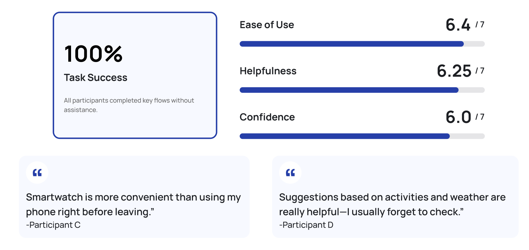
In moderated usability testing with 4 participants, CarryOn achieved 100% task success across all core flows with no facilitator assistance. Users rated ease of use at 6.4 out of 7, helpfulness at 6.25 out of 7, and confidence at 6.0 out of 7. The departure confirmation and contextual suggestions were cited most frequently as the features that changed how users felt about being ready to leave.
What I Would Explore Next
CarryOn was designed as a capstone prototype, and like any project, it has clear scope boundaries. They are the defined edges of this iteration, and each one points toward a specific next phase.
1. Reliance on user input accuracy
Current: relies on users providing complete trip details upfront. Next step: progressive disclosure of suggestions as users add context over time, reducing the burden of getting it right from the start.
2. Assumption of smartwatch availability
The departure confirmation is optimized for Apple Watch. For users without one, the phone fallback achieves the same closure goal with slightly more friction. A future iteration would test whether notification-first triggers on mobile perform comparably.
3. Limited support for complex trips
The current model works best for single-destination trips with one packing context. Multi-city trips require nested packing structures and location-aware suggestions. This is the highest-value expansion path for a future version.
What This Project Taught Me About Designing for Closure
The hardest design problem was not the packing list. It was the moment of closure. Most of my early concepts solved for completeness. The research showed that completeness without a signal is not the same as done. Designing for that specific moment (departure confirmation) taught me how much product value lives in the transition between states, not the states themselves.
Scoping this project tightly made it stronger. I removed Apple Watch integration before adding it back once I had a clear rationale for it. The discipline of asking "does this serve the core question" for every feature is something I now apply to every project from the start.